

Juice Generation UI Redesign
Juice Generation is one of my favorite smoothie shops. They recently relaunched their app with a new UI making it more visually appealing and on-brand. But I noticed some inconsistencies and room for improvement so I set out to make these new changes to the design. See below!

Current UI


UX/ UI Audit
Splash Screen
1. I noticed the menu button here on the splash screen which I found odd because it didn’t follow the usual patterns and mental models of users. One would be looking to log in when they land on this screen, and including a menu option could deter them from doing so.
2. This logo was all white which was not great for contrast and accessibility. I was aware of a darker version and switched it for better contrast and brand recognition.
3. On the splash screen, both of the CTAs are the same color. I decided to address the visual hierarchy here and changed the sign-up button to a different color highlighting it as the secondary option.

Login Screen
4. The first thing I noticed was there was too much white space so I incorporated more color because the brand is known for its bright and fruity boldness.
5. I kept the Juice Generation logos on the home and login page for brand consistency.
6. Login with email was a little confusing. It seemed like this was another option. I believe the color was also meant to signify an inactive state, however, inactive states are not typically associated with the login button and the gray color was not apart of the brand colors I pulled from the company website.
I thought it’d be best to simplify this button to say “Login” which was standard practice and also make this button more prominent since it was the next course of action.
7. I noticed the inconsistency here with Login and Sign In so in the redesign, I kept everything consistent and used the phrase “Login”
Home Screen
The main issue with the home page was the hierarchy and layout of information.
9. The title of the page was in a card taking up almost 2/3 of the page.
10. There was an ellipse dot which seemed to signify the card was a slideshow but it may have been used improperly as a decoration to separate the two sections.
11. The most important information (at least for me) would be the rewards information - How many points the customer has and how many points until the next reward. This information should be prioritized. It was also a little clustered here and still unclear how many points were achieved. The gray color here was also off brand.
12. Lastly, the barcode was important to have the option to scroll because this is what the user needs to get their points. This should remain within the first frame so that customers don’t forget to redeem their points
13. My rewards section was all the way at the bottom of the scrollable page so it was practically on the second page. For hierarchy purposes, this should be placed at the top again or in the section with the point balance. Placing it at the bottom of the page leads to a poor user experience. It’s also redundant.


Rewards Screen
The Rewards screen was interesting to analyze because of the information architecture.
14.1 & 14.2 I also noticed "rewards" and my rewards" was mentioned twice and the information here did not have a good flow. If the main reason for users is to get their rewards information this should be at the top of the page.
15. History section here was placed at the top of the page
16. The History section had a dashed rectangle which was a different pattern than the other sections. It was also not consistent with the shape of the other sections.
17. Balance - The misaligned placement of Balance at the top of the column was a little confusing because it seemed to be categorizing the Points that have been accumulated.
18. Stored Value - The terminology here was a little confusing because Balance was also being used. If we think of mental models here, users (customers) are more familiar with the term “Balance” as it refers to how much funds are available in the account.
19. The My Rewards section had rectangular boxes with shadows. Shadows are typically associated with buttons so I felt this was a little misleading. I actually pressed on each section thinking there was another action to be taken. However the “My rewards section” did not allow for any actions to be taken.
20. There was too much white space for a brand that embodies color.
UI Redesign
Color Palette
I pulled the color palette from the Juice Generation website for brand consistency.

I decided to address the visual hierarchy here and changed the sign-up button to a different color highlighting it as the secondary option. I also decided to remove the menu from this home screen because it didn't follow standard UI patterns.

Initially there was a lot of white space. I incorporated more color because the brand is known for its bright and fruity boldness. I noticed the language changed from login to sign on the login screen so I kept everything consistent with the phrase “login” I replaced the previous icon with the Juice Generation logo instead for brand recognition.

To implement visual hierarchy, and consistency, I changed the Delete Account button to a white one instead of the former green color, so it was clear that SAVE was the primary action to take and delete account was secondary and less prominent.
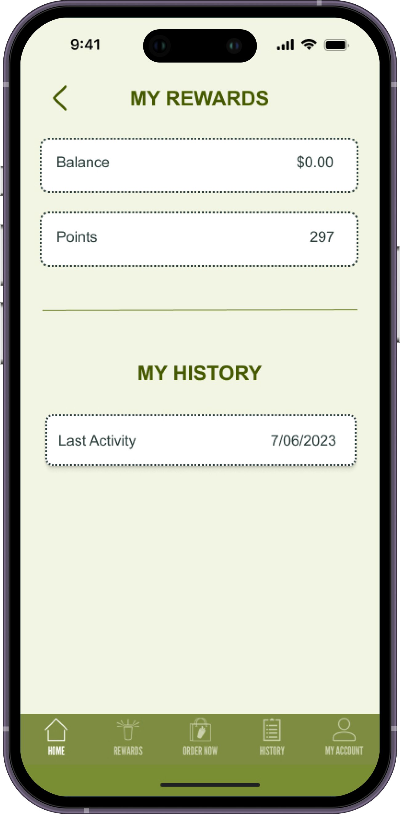
I decided to organize this information a little differently highlighting the balance and the points in the upper section as this is what's relevant. I also kept the terminology of "balance" instead of stored value because this is what's commonly association with gift cards, etc. I also decided to change the style of the fields with a dashed rectangular box to signify this was the rewards page. I then added a shadow to "last activity" to indicate this was a clickable section.

Lastly, I split the page into 3 sections and made sure to feature the rewards section prominently. I highlighted the amount of points the customer would have in their account as well as the remaining points until the next reward. I changed the visual for the progress bar. Previously there was too much information and now customer could better visualize how close they were to the goal. For the barcode, I made sure this was clearly on the first page and that the user wouldn't have to scroll to access the barcode. This is how users would get their points so it needed to remain accessible and positioned in the bottom of the page so it's easier to scan.
Final Thoughts
To improve the navigation for users I recommend the following:
Change the Home Page title to Rewards. This is the primary reason the app is being used.
Remove my history section from the rewards page and move it to History in the bottom navigation menu
Remove the Messages icon from the Rewards page and create a Messages page in the bottom navigation menu
The bottom bar should follow this flow: Rewards, Order Now, History, Messages, Account