Expunge Assist
Responsive landing page design for a legal tech nonprofit to increase partnerships and improve volunteer onboarding experience
Services Provided:
UX Design & Development

According to L.A.’s public defender’s office, there are 200,000 felony and misdemeanor convictions eligible for expunging."
Overview
Background
Expunge Assist,(a division of Hack for LA) has developed a web tool that helps legal professionals in California expedite their criminal record clearing process by generating statements for petition submissions for their eligible clients.
Expunge Assist makes the process of writing a personal statement for expungement easier and more manageable for clients.
Task: Design a landing page that will convert more legal partners
My Role: Product Designer
Product Management Team: Daniel Lee, Gretchen Howard, Andan Eddy
Design Team: Gyan Prayaga, Lu Wu, Ryan Curtis
Research Team: Gilles Babou, Myranda Pierce, Apurva Barve, Yumeng Luo
Development Team: Cade Mallett, Alex Choi, Daniel Xiao
Partnerships: NDICA, Code for America
Tools: Figma, Github, Illustrator, Qualtrics, Miro, Google Suite
The Problem
Over the past two years, partnership growth and inquiries have stalled.
The current outreach process to recruit legal partners involves searching for contacts online, cold-emailing them, and directing them to a defunct website, is not effectively converting partners.
This is causing issues for the team at Hack for LA, as they need to secure partnerships in order to finalize their research and launch their MVP (Minimum Viable Product) for Expunge Assist.
The Executive Director of Hack for LA, noticed the partnership outreach process was broken after failing to convert legal partners in order to finalize research to launch their MVP
“We need partners in order for Expunge Assist to work. We need partners because this tool is for them! It’s essentially a B2B for expungement clinics and we need to do research with the partners to validate our product.
Otherwise, we would need to reevaluate our audience and design directly for the client (i.e. justice impacted individuals).
Without a website, we would have to continue the long inefficient way of communication, spending time in emails and trying to coordinate times, and the downside is emails get overlooked as partners are probably drowning in paperwork and email and cannot understand how the tool works.
With a website, partners can find a time and take action, understand how the tool works and be empowered to schedule a meeting and even fill out questions ahead of time.”
— Andan Eddy, Product Manager
The Challenge
The team has had a low conversion rate for partnerships, with only 2 out of 15 partners converting in 2020, and it is not specified how many were converted in 2021.
The problem is further exacerbated by the fact that legal partners are busy and may not have the time or understanding to engage in back-and-forth communication and scheduling with the Expunge Assist team.
Additionally, the team assumes that without a website, they are losing opportunities to build relationships and collect data from legal partners to validate their MVP.
In summary, the main problem facing Expunge Assist is a lack of partnerships with legal clinics and other legal professionals in California, which is stalling the launch of their MVP.
The team needs to create a more cohesive and professional digital presence to effectively convert partners and validate their MVP.
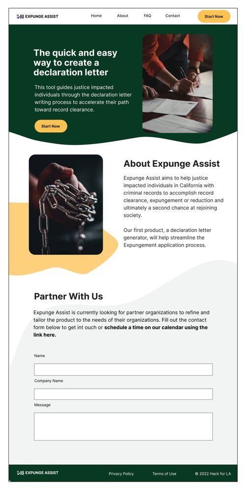
Solution
A possible solution to the problem of a lack of partnerships with legal clinics and other legal professionals in California for the Expunge Assist team is to create a more cohesive and professional digital presence, specifically a website that effectively showcases what Expunge Assist is and how it can benefit legal partners.
This page would allow legal partners to easily schedule meetings and quickly understand how the tool works, which would potentially lead to more meetings and partnerships with the Expunge Assist team.
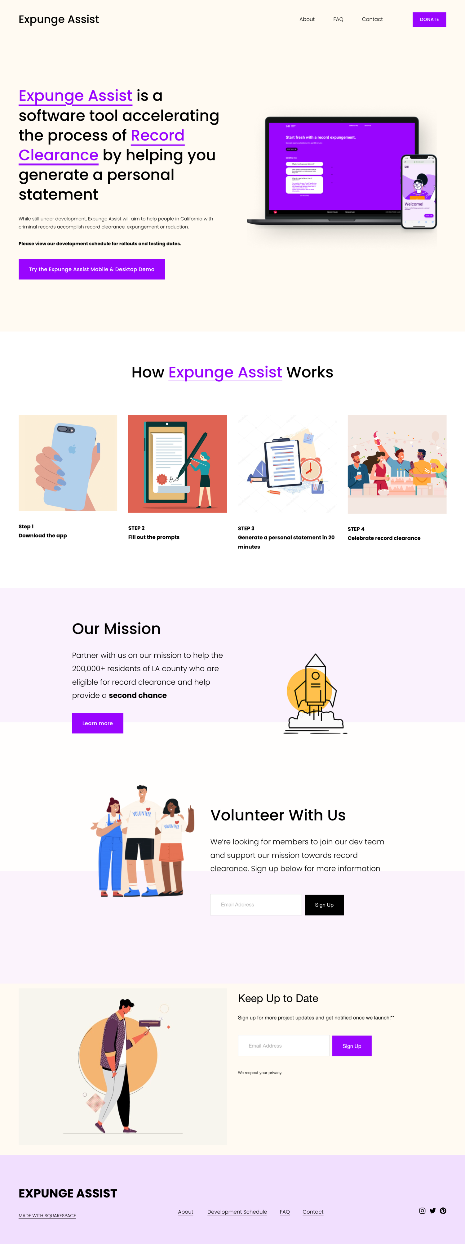
Site Audit
After performing an initial site audit, I realized there were a number of things that could be improved throughout the site such as:
Website wasn’t engaging the target audience
Poor User experience - it was difficult accessing information
Poor Accessibility
Landscape Analysis
After embarking on an exploration of the nonprofit and civic tech websites, we noticed a number of common best practices
Key Features to Include
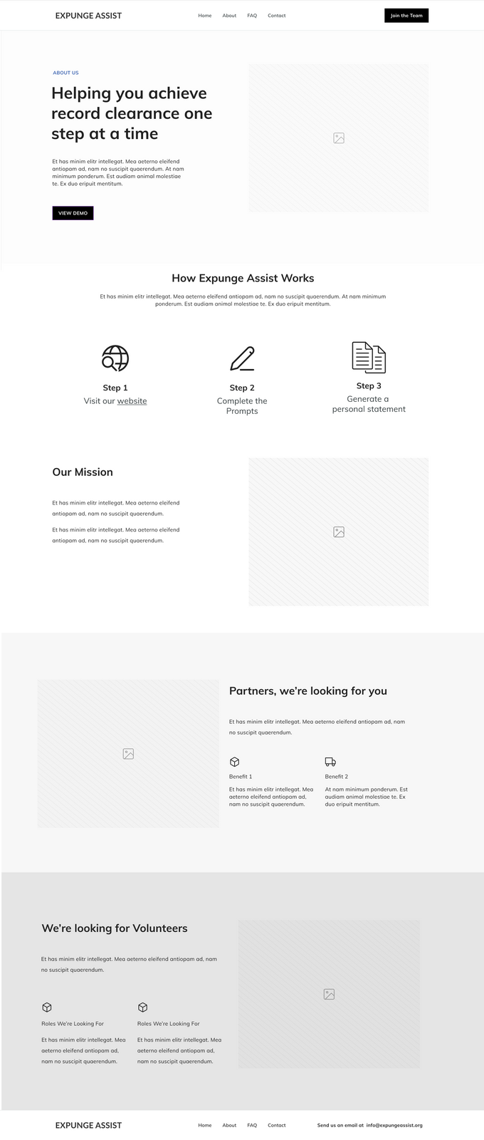
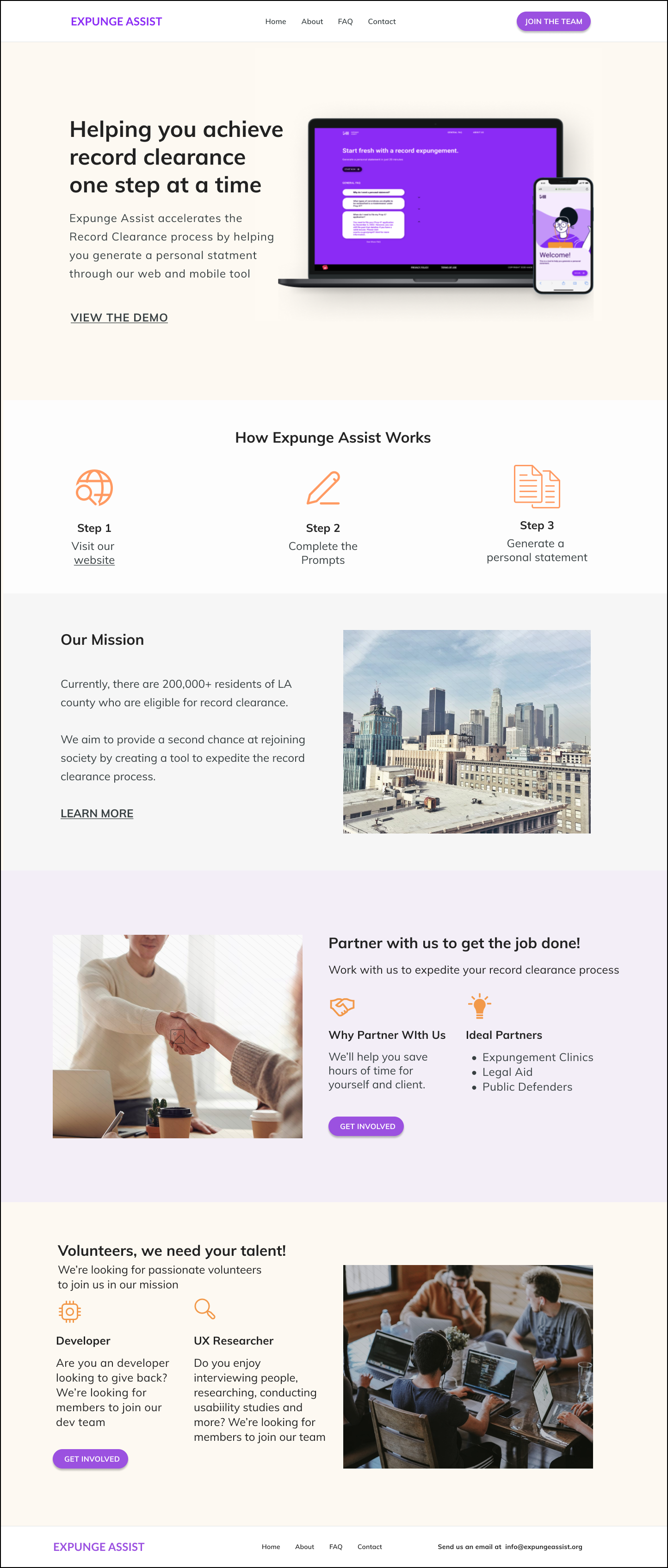
Product Demo
Consistent Branding
Strong mission statement above the fold
Clear CTA with color emphasis
Clean layout with minimal text
Interest or Newsletter Form


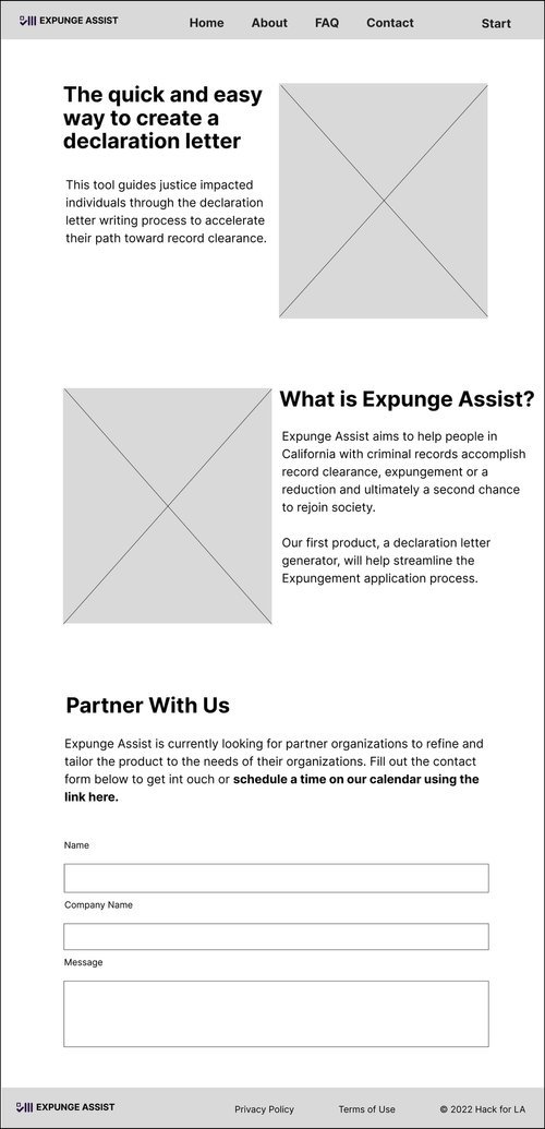
Wireframes & Iterations