
Over the summer, I worked as a Hostess at Mark’s off Madison. I had a unique perspective on the needs of the users (patrons) because I would field many of the questions they would call to ask.
Incorporating these insights into the website design would reduce the number of phone calls, and questions from users and the workload of the Hostess and Manager, leading to increased productivity.
Additional Benefits of a UX Audit
Improve the overall guest experience from website to-door
Reduce the number of questions
Decrease the number of lost or confused guests
Fewer interruptions = increase in productivity

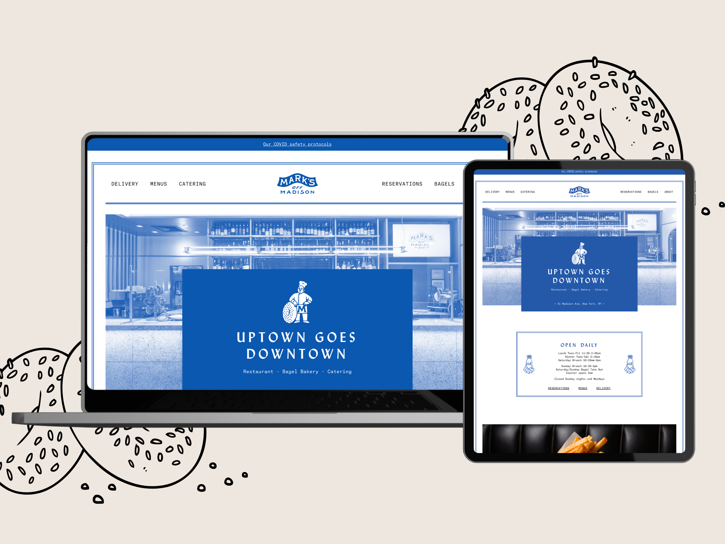
Current Website

UX Audit
Navigation Menu
Include a CTA button for customers to call
Include a CTA Button to view the food menu on mobile
Add a hamburger menu for the navigation bar on mobile
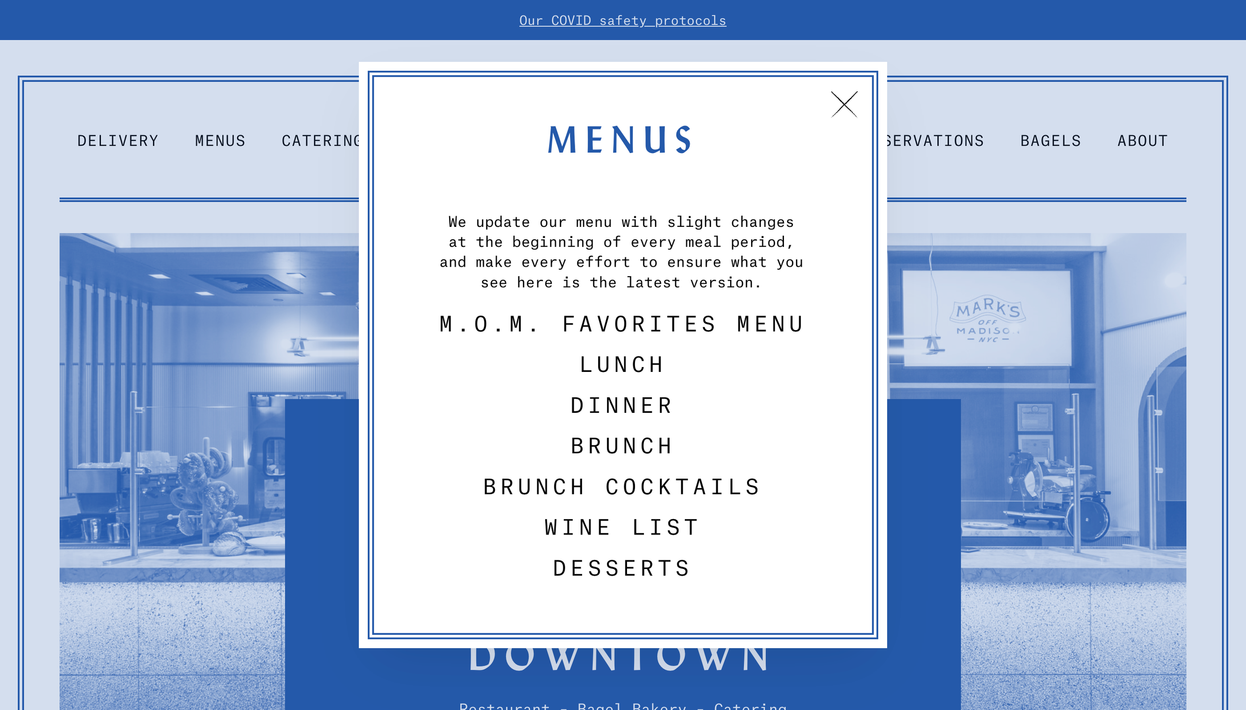
Menus Tab
Currently, menus are opening in a new tab and redirecting to this tab on mobile
if we open menus in a new tab there has to be a way for them to go back to the previous screen, especially on mobile
Also, we can add a searchable menu feature because they're often looking for a certain meal (which menu is X om)
M.O.Ms favorites are shown as a separate menu which is confusing because it’s part of the dinner menu - let’s combine dinner, lunch, and brunch menus together
Solution: Add a Menus PageAdd a flipping animation for menus to mimic the actions patrons would take and add more interactivity - this way we keep users on the same page and we don’t lose the analytics/footprint. keep all menus on one page and add anchor tags or menus that appear as you click the tab
Consolidating the menus according to time of day and adding some interactivity so users can flip through the menu as they would in person instead of just being shown the menu without any guidance
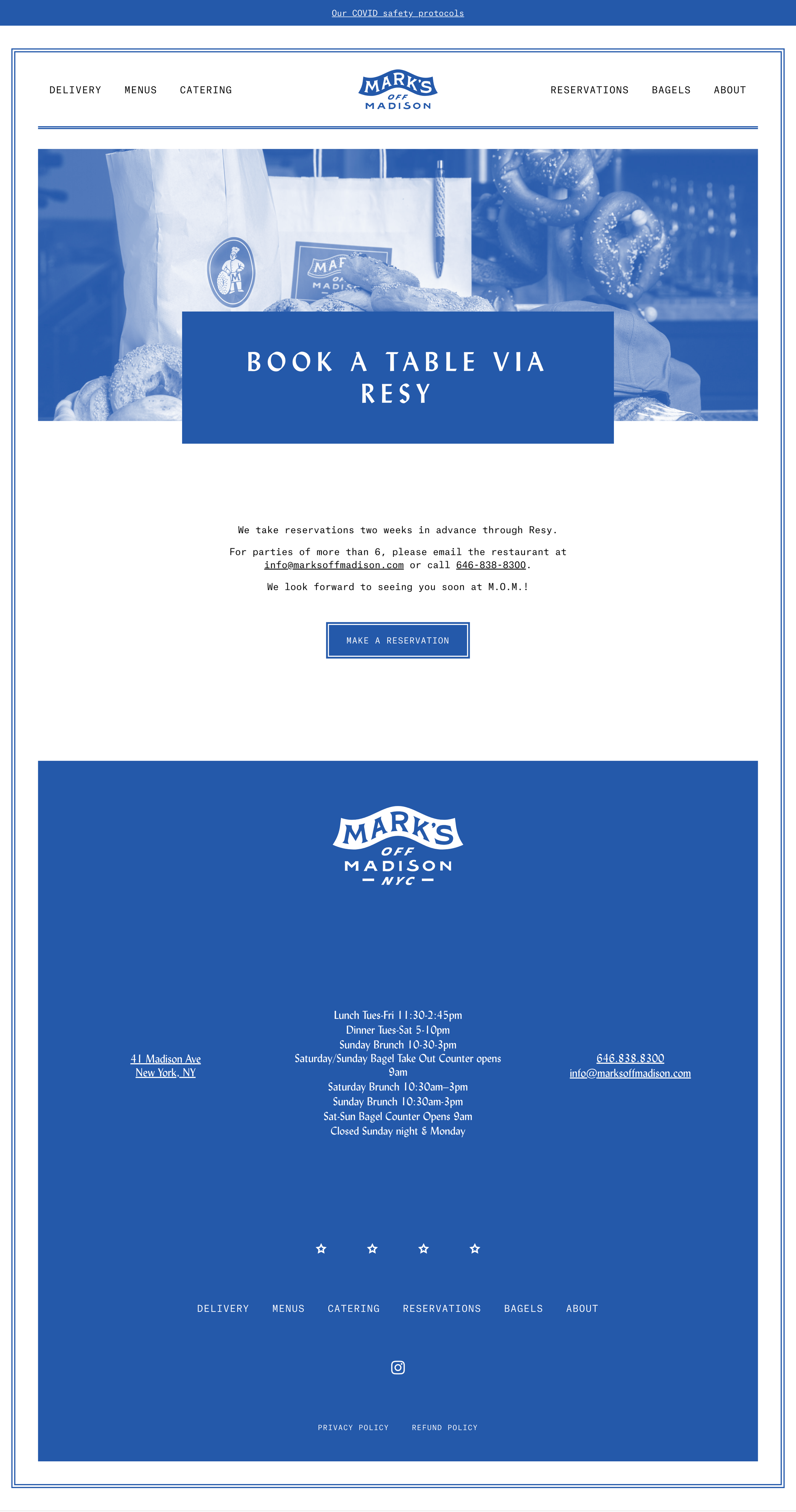
Footer section
Location & Hours
I would often get asked where is the cross street. Because the restaurant is located in the middle of the block (close to Madison Ave) it was confusing for some people to find. Adding more clarity to the location and reducing the confusion of potential patrons would
Hard to read due to the font and lack of hierarchy
Solution: Update this to show weekday and weekend hours with headings
Highlight the Phone Number where the address is located at the top because this is a priority CTA. this is what they will be looking for.
Microinteractions / Interactivity
Add a music playlist to the website so they can vibe to the music at home and increase emotional connection
Add FAQs
-
Are there foods with pork?
-
-
What is the cross street/location?
-
What foods should one avoid if they have allergies?
-
Yes, we do through DoorDash, Caviar Seamless, Grubhub
-
We are closed on Mondays.
-
-
Is there any parking nearby?